Showing posts with label Landscapes. Show all posts

Saturday, October 19, 2013

Not a lot to say...

It must sound (or look) like I just cut and paste the same comment every time I post something these days, but I still feel the need to make the excuse...
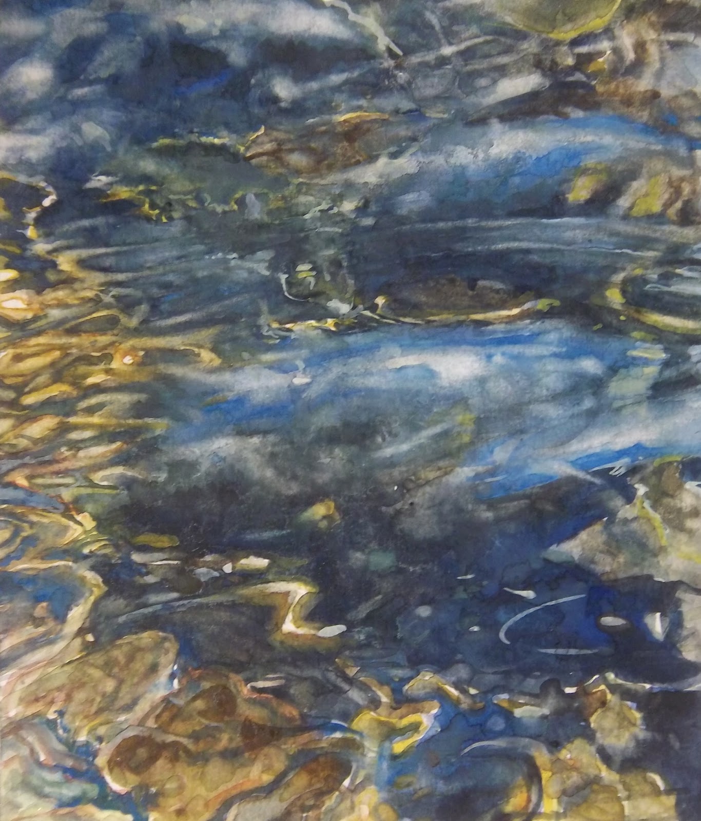
I have been working so many hours lately that this small painting sat on my desk for weeks before I did a few more things to it and decided to post it.  I'm not quite finished with it.  I just got tired of feeling like it should be done.  Initially it was going to be a quick impressionistic study, and it is for the most part, but  I ended up having to do more with it than I intended. 
   Things are not all work, however.  I was able to take a long weekend trip to the coast with my wife last week and we had a fantastic time.  And of course I have squeezed in some golf...
I have found that if I don't start working on a painting in the morning, the distractions of the day seem to prevent me from doing anything at all.  


Monday, September 23, 2013

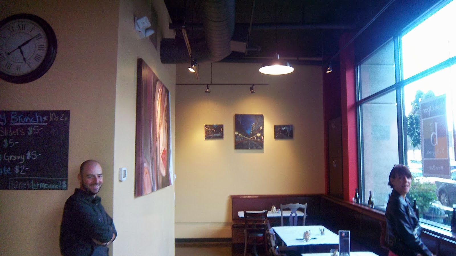
Urban Landscape Trio B Squared Wine Bar


The trio of  Cityscapes are complete.   They might need a little more positioning, but for now...at least they are up.

My wonderful wife Lecia and buddy Zach helped position the paintings


I hung the final of the three Urban Landscapes I did for the B2 Wine bar in the Pearl. 
This little gem in the Pearl District just opened this month.  My  wonderful wife Lecia and  my good friend  and golf guru Zach Welch gave me a hand in the positioning.  Now I just have to move the lighting a little more to center.  I have one more to do for the wine bar, but according to Zach, there has been interest shown in the center painting already, so with a little luck I could be doing even more. 
The coffee shop B2 Coffee Haus, which is located a few doors up in the same building features 8 of my watercolor paintings as well.  I'm not going to lie about this.  When I went in to hang this third painting, I was stilll very pleased with how the other small painting came out.  Usually there will be something that I want to change about a painting, but this one still suited my eye.
Of course you can always get better, and I will.  However it is necessary to be satisfied with a result.  That's what keeps me going.  That and being able to see my work somewhere other than in my painting space.
  I have been wanting to paint  more, but time hasn't allowed it lately.  This makes for some frustrating days.  Hopefully this will change soon. When faced with such a small amount of time and so many choices of what to do,  the brain will often choose to do nothing.  That's the battle I'm facing now.  I have so many ideas, but I know I don't have time to do even one full painting, so I end up not even getting started on one.

Sunday, September 15, 2013

Cityscape: New Lessons learned


As I read through the original post about this painting I realized how my opinion had changed.  So I decided to update what I think about this painting. 
It is interesting to see how my opinion can change about my own work even though I have left it alone.  This painting grew on me more and more as the weeks went by.  I began to look at all the positive things rather than where I had struggled with it.  So when I look at it today, I am satisfied and comfortable with it.  There will always be things that you feel you could have done better, but at the end of the day, if you achieve the visual result you wanted, you have suceeded.


Sunday, August 25, 2013

Early Saturday.


Early Saturday on 6th   12X16" Acrylic on Canvas

 I started this one Saturday morning.  I chose the smaller canvas thinking that I first needed to establish a rhythm of painting.  Initially  I couldn't picture in my head how the painting would work, but I kept going.  I added layers to the foreground, established some lines and kept adding layers.   Eventually I was able to work thru the problems and it emerged quite nicely.   I'm learning that you can't paint as freely with Acrylic as you can with watercolor, unless you don't mind wasting a bunch of paint.  I usually mix colors on the fly, but I don't expect them to dry out in 10 minutes.  I know there are ways to make them last longer, and I'll have to look into doing that.  I do like that you can layer them as well as make them opaque.  Well, its on to the next canvas.  I need to do a larger painting.  This one's 12X16"


Downtown Early Morning...So Far

This is the Acrylic Painting I've been working on.  I've got some tidying up to do here, but the main portion is done.  This is a rare case where the original actually look better than the photo.  It's very difficult to capture the dark colors with a camera.  I was thinking about making the headlights in the background more prominent, but this seems to be working as well.  I'll have to sit on it.  Im moving on to the next scene.  A larger painting that might test my resolve to ge this project done. 
  One thing I have discovered again about Acrylic paint.  It dries faster on the pallette than you can paint most of the  time.  This makes me think harder about moving to oils.

Sunday, July 14, 2013

B Squared Coffed Haus and Wine Bar


Getting Closer:  After a couple of days of scrambling to get 7 paintings framed, I am finally ready to hang them at the B Squared Coffee Haus.  I have to remember that unless I paint in specific sizes, I will have to wait 2 to 3 weeks to get my paintings framed.   I had to crop some of these paintings in order to get them to fit in the pre-made wood frames.  Luckily, the only frame color I needed was black, since my supplier carries that and natural wood.  I haven't looked into other frame shops much, but I am pretty loyal to the I've Been Framed Art supply and framing store.  They cater to the working and aspiring artist and their prices and helpfulness can't be beat.    More later...
I painted a large version of the Summer Lightning Painting for the B Squared Coffee Haus. I'm in the process of mounting it on Gator Board.  Trying to figure out how I can hang this.  I wasn't able to find cradle board to fit the 22 X 42 size on short notice. 
My mat cutter served me well for all of these paintngs.  I was able to cut them to very specific sizes to fit the pre-made frames. 

Saturday, March 30, 2013

In a fist fight with detail. Patience on Trial...and, "Cosmic Rocks?"

 I posted the current stage of this painting first.  That's because I knew this would appear as my thumbnail pic, and I didn't want to deceive the viewer into thinking the mid stage pic was where I'm at.  I'm completely aware that the mid stage picture might look better, but in reality it is not.

 Current Stage:The camera loves to pick out that light blue (Cerulean), but this was as close as i could get to showing the actual colors. That Light blue is not as evident in the actual painting.  Maddening.
Mid Stage: This seemed to be going in the right direction here, but I wasn't happy with the forms, mostly because the left side, which I didn't get in frame, wasn't blending with the rest of it.  I thought about leaving the bottom blank.  When I went back to it, I decided that was actually drawing too much of the eye.  Keep in mind that the bottom was completely white, not that cool looking color the camera gave the blank area.
I went into this one with the intention of grinding out the details in small bits and pieces to make one cohesive, identifiable painting...The more I tried, the less it worked.  I'm disappointed at the result.  Not so much because of the painting at this stage, but because of the amount of time I invested in trying to make this work in the way I had intended.  I could not find the right color of blue show what I wanted to portray.  The cool reflection of light on the surface.  This was frustrating, and I had to leave it the way it was for now.
I woke up this morning thinking about where I can make a studio space for oil painting.  This would have been so much easier in oil.  And I don't even work in oil.  The writing is on the wall for me, and I have to make the commitment to making this happen.
With watercolor I have found that as much as I try to work from light to dark, I can't resist throwing in some darks before I have finished under-laying the lights. I have to have a visual reminder of where I'm headed.  I think this is where I get myself into trouble.  Because I have to keep pulling those darks back out where they have bled too far into the light areas.  I also have a hard time accepting too many hard lines in my paintings because I feel they look forced.
You might think by looking at the first painting that it was going well.  But as I mentioned, the painting wasn't looking cohesive with the lighter, sharper lines on the left side (which are out of the frame in that photo).  I do see that the light reflections are more successful in the earlier stage, and I'll probably go back in and make them more prominent in the finished version.  For now I'm moving on to my next project, taking the lessons learned here into account.
Andrew Wyeth once said.  " If one could only catch that true color of nature - the very thought of it drives me mad."  And I thought it was just me.
One final note.  If you can't tell what my subject is, don't worry.  Part of my disappointment comes from knowing that the subject is not evident.  Nothing is more discouraging in my mind as when someone has to ask what it is you're painting. Suffice it to say that I have now decided to classify this as an abstract and title it Cosmic Rocks. 

In a somewhat unrelated note.  One of my favorite painters is showing in NY.  Heres the link to the show.

Thursday, March 14, 2013

Library "Study"?

Woodstock Library from the Lawn
 Our neighborhood (Woodstock) Library is a modern icon. When I decided to paint it, I was concerned that the art of the architecture would overtake the art of the painting.  It has a lot of very nice designs (not visible here) that are etched into the panels along the front.  I'm drawn to certain buildings, usually older ones because of the historical value they hold.  I wanted to paint something important in the neighborhood for our local organization Southeast Uplift.  Since the Lutz Tavern is not exactly an acceptable representation of a neighborhood...I really like how that one came out, though.
The Library was rebuilt in....2000 I believe, and even though the new building itself has a short history, the Library history is there.
This was intended to be a loose rendering of the building but as I progressed through, I had to tighten the lines a little.  I wanted to include a library goer in the final painting, and this would be from an angle looking opposite this, but I was pleasantly surprised how this one came out. I spent considerably more time on this than I originally planned, trying to work out the reflections in the windows, the grass in front and the trees that are beginning to bud.  I still plan on painting the nice lady that I photographed in my reference photo.  She asked to remain anonymous, so I won't mention her name when I paint her.  Anyway, I think this painting came out better than I thought it would, so I might just choose this one to submit if the next one doesn't work.  Sometimes the study offers more interest to the viewer.  I will have to see.
I guess I would be remiss if I didn't mention the other neighborhood Icon in this painting.   The Joinery

Wednesday, February 20, 2013

Foster Apartment sketch

A little sketch (5"X7") of those apartments behind the Art Supply store.  I'm trying to work a little more raw and gestural so that I can get more paintings done in a smaller amount of time.

Saturday, February 9, 2013

Birch Tree final answer....


At some point early in the week, I decided that the effort I put into the (first) Birch Tree painting was insufficient.  Though I rarely do this I started it over.  The reason I rarely do a painting again is I feel that if I don't succeed, I will have wasted twice as much time on one thing.  Time doesn't allow me to waste time on one try, much less two tries.  But I felt strongly about this project.  There were elements in the first one that showed possibilities.   I took the reference photo at Gabriel Park last winter and had thought about it quite a few times.
To be honest, it's hard to go wrong with birch trees in the sense that the white bark makes it  immediately recognizable.  The angle looking up is appealing to the eye, and....it's a tree.  No one can accuse you of putting a branch in the wrong place.  Speaking of which, I found it a challenge to get the branch coming in from the right side of the painting to look right.  It followed the angle of the branch behind it, which made it look too symmetrical to the branch behind it.....If you want to read the boring details there's more below. 

Tuesday, February 5, 2013

Small Framed Paintings, Birch Tree started


I finally filled the 3 small frames that were Christmas gifts from my sister Paula and bro in law Scott.  I also started that painting of the birch tree.  More on this later.

Sunday, January 20, 2013

Warehouse finished

I tried to strengthen the color a little to convey the strong sunlight against this yellow building.
I worked on the Warehouse to correct some of the lines.  I believe I can do a little better next time around if I choose to do a more refined painting.  But I was satisfied with the over all look of this one. I would like to try some wet on wet for the sky, even though I don't really mind the somewhat textured look in this one.  There are some areas in this one that I really liked.  Specifically the shadow of the tree on the right side and the loose brushstrokes in the tree.  I also liked the contrast of the yellow building and the shadows

Saturday, January 12, 2013

Warehouse

Warehouse.  Still in progress I guess.
What started out as a relatively simple shadow study ended up a little more tedious than I anticipated.  Having a distinct vision in mind would have helped.  I liked the shadow against this bright yellow warehouse wall.  The color scheme looked pretty simple, but I struggled to get the right colors, and when I went to paint the tree, I found it difficult to portray the light spots.  Still some work to do, but I think it will be worth the effort.  The shadow of the second tree (out of frame) fools you a bit now that I look at it.  Funny thing about shadows.  They are affected by the surrounding objects more than one might think.  The top of the wall was considerably lighter.  And I noticed some lines got out of sync. I don't plan on doing anything drastic, being that the lesson has been learned on this one.

Monday, November 19, 2012

Woodstock Park Series

Tuesday:I'm not done with this one yet, but I think I need to put it away for a few days so I can figure out where I want to go with it.  When I started it, I had the intention of cropping the painting to make it work, but I think that lack of focus hurt me when I went to paint it.  More about this later....
And it is later: Wed.   So after looking at the painting I knew that I liked the sky, but wasn't sure about the building (school) on the left.  Then something struck me.  I think this painting would really work if more of the sky was featured in the top half.  Too much foreground and not enough back ground. In fact, the more I look at it, the more I realize the sky could have really brought this to life.  Lesson noted

Sunday, October 28, 2012

Inspirations in Paint Exhibit.

A great Saturday... to echo Gary Everest.  I finally got to meet Celeste Bergin and David Burbach after months of following their blogs. (Photo by David Burbach)
I live only a mile from Eastmoreland Golf Course.  So when I checked Celeste's blog and discovered that she had an exhibit there with Kat Sowa, Dave McBride, and Anton Pavlenko I had to get over there and see it.   I met the other artists and as an added bonus photographer David Burbach.  I had a chance to talk with Celeste, David, Dave McBride and his wife.   I can say that even with David Burbach's professional touch in photography, there is no substitute for seeing the paintings in person.  The exhibit was appropriately named Inspirations in Paint.  They inspired me to get on the ball and do my daily painting again.  Donations from the show went to CASA benefiting children in the foster care system of  Multnomah and Washington Counties. 

Friday, October 26, 2012

Woodstock Park early evening

Woodstock Evening.  6.5" X 8"  Watercolor . SOLD
Once again it was difficult to photograph this painting without distorting the colors.  It's not this dark, but the other option made it look too washed out and blotchy. One day I will either get a better camera, or learn the proper way to photograph my work.  If you stand back about 30 feet you might get the overall effect.  Anyway, I stopped working on it .  I think it's time to move on. 

As I learn more about representing lights at night with watercolor, I feel confident that I will one day have an approach that isn't as hit and miss.  I had a couple of moments where I thought I had ruined it, then turned it around. Finally, I figured that I should take the lessons learned here and move on. Though you can barely see it I liked how the reddish brown around the foreground lights gave the slight glow needed.  Pulling the tree trunks from the dark background was useful, and adding the texture of the ground in the left foreground was also a positive move.  Letting the trees in the top left form from the drips added one of the elements I was looking for in a night painting.  I couldn't get the foreground to produce the same effect.  I don't mind the tactile look of these types of paintngs, but I know I have to be careful where and how much I allow that to happen.

Sunday, October 7, 2012

Acrylic Abstract

Abstract Acrylic

Detail: I pasted a photo with glaze and painted around it.
I realized today that I hadn't posted this Acrylic abstract I composed last year. I hadn't worked in acrylics for decades, so I took a little course on acrylic painting and enjoyed this little experiment to test the different textures and effects one can achieve by using the different paints and glazes available.  I used about every one in this little 6 X 6. Although I was encouraged by this result, I decided to continue with my watercolor focus.  I figured I shouldn't  divide my focus, given the limited time I have to paint.  Also, investing in a bunch of acrylic products is kind of expensive if you don't plan on spending considerable time on it. If I decide to go into acrylics, I will shift my focus primarily on that.
    On the subject of focus,  I find myself feeling a strong pull toward at least a few large canvas paintings.  I have some general ideas in mind.  It's hard to go day after day feeling that there are paintings in me that need to be done, but I don't have the time to produce them.  Until that time I'll have to continue to work toward that end by choosing subjects in watercolor that will get me closer to it. 

Friday, April 27, 2012

Sketch for Night Scene at Woodstock Park

First sketch for WNS
I started this sketch weeks ago after I posted the night scene reference photo.  I thought I should post it because I've found that action can give me a little kick start. I used my daughters Oil pastels for this.  I found them to be cumbersome to work with because I have trouble blending them.  I know I'm not using the right paper or technique, but I much prefer traditional pastels.  I plan to pick some up this weekend.  I don't know what happened to the huge stash of pastels I had years ago.I used to keep them in a little brief case.  Must have been tossed out when we moved.  That surprises me because I hate throwing out art supplies more than I hate throwing out old shoes. One might think I grew up in the depression era the way I save old crap....but I digress.

Thursday, April 12, 2012

Remnants of the Past.

I couldn't stand to see that last post on my blog anymore.  It reminds me too much of how little I've done lately. so here's something else to look at......This is the only thing left of this painting.  All of the pictures on my computer were deleted when it crashed.  That didn't really bother me too much though. I have some online and backed others up before the crash.  This painting was cut up to use for a gift tag I believe.  Kind of a cliche painting, in fact a sample photo that comes with Windows looks a lot like this.  I've been struggling to make time to paint, but mostly because I am back to my procrastinating ways and it has caught up to me.  Should have more time once the taxes are done.