I made a mistake in this slideshow. I incorrectly identified the music as done by Moscillate. It was actually done by Mr. Jozzy. I apologize for the error. This is the corrected version with the last slides improved and corrected
Wednesday, December 18, 2013
Friday, December 6, 2013
"Resentment is like drinking poison and then hoping it will kill your enemies."-Nelson Mandela

I wanted to do a fast sketch of him to honor him, but I just don't have time before work. The quote is particularly significant in my life right now in light of some of the things I have seen and heard in the recent past. Ignorance is the root of hatred...and it goes both ways. We need to start and keep a dialogue about these things...
Sunday, November 24, 2013
New slideshow: Not very happy with the program I bought
Tried out a new slideshow maker for my recent work. Wasn't happy with the limitations of the program. Can't get music to sync with the length of the show. Music will loop when you would rather have it fade and stop.
Sunday, November 17, 2013
A Great Saturday in Eugene
I don't often post photos of events here, but then again I don't get many chances to attend events. My daughter Grace got us tickets to the Oregon Ducks / Utah Utes game Saturday. This was only my second college football game and I have to admit, it was most impressive. What a top of the line program. The entire complex looked like a Nike ad, and I guess it was. Ducks started slow but came out in the second half and blew the game open, winning 44-21. Utah scored a touchdown just before halftime to make it close. Then on the ensuing kickoff, DeAnthony Thomas returned it for an 85(or so) yard touchdown.
 | ||
| Adding a few touches to the Max painting before leaving for the game Saturday |
 | ||||||
|
 | ||||||
|
Sunday, November 10, 2013
Saturday on Max: Accepting the challenge.
 |
| Saturday on Max 14" X18" Acrylic on Canvas Panel |
I spent the better part of my Wednesday attempting another cityscape. It did not go well. However, as with most paintings I learned a few things along the way. I was also reminded of a couple of things. The most important being that you can never compromise on the composition. I thought I could compose the painting without precisely measuring the angles. I was wrong. No matter what I tried the painting was just a little off. I had to scrap the entire painting and choose a new subject. So Saturday I chose this challenging scene of a Max train going up the downtown transit mall. I had shied away from this because I wasn't sure how the Max train would end up looking. But I really liked the scene.
I thought I would start by painting some of the train to get some practice with the values and angles. So I began to paint over the last painting. As it progressed I realized that it was going well enough that I should continue. By Sunday morning I had committed to this version. So what had started as an exercise painting over the last panel ended up being a finished painting.
On a side note, I took photos of the process. At one point I washed the entire top of the painting with white to get rid of the painting beneath. This created a very interesting fog like effect with the buildings in the background of the old painting creating ghostly images and the train emerging into the foreground. I liked it so much I almost left it as it was, but I was determined to try to finish the scene. And I thought I could always go back later, wash it out and achieve the same effect. Later as I was putting in the trees, I decided to try and go back to the wash. This didn't work because the trees were now part of the painting and the effect was not believable enough.
Unfortunately the photos I took of this effect have been lost forever. When I shut off my old camera, the lense refused to retract into the body. Long story short, the camera was in my pocket, and when I went to change clothes today, I stepped on the lense and effectively killed the thing. The photos are in the camera's internal memory (another result of the dying camera) and it will not power up. So new painting, and new camera today. Both were long overdue.
 |
| Detail. |
Saturday, October 19, 2013
Not a lot to say...

I have been working so many hours lately that this small painting sat on my desk for weeks before I did a few more things to it and decided to post it. I'm not quite finished with it. I just got tired of feeling like it should be done. Initially it was going to be a quick impressionistic study, and it is for the most part, but I ended up having to do more with it than I intended.
Things are not all work, however. I was able to take a long weekend trip to the coast with my wife last week and we had a fantastic time. And of course I have squeezed in some golf...
I have found that if I don't start working on a painting in the morning, the distractions of the day seem to prevent me from doing anything at all.
Monday, September 23, 2013
Urban Landscape Trio B Squared Wine Bar
 | |
| The trio of Cityscapes are complete. They might need a little more positioning, but for now...at least they are up. |
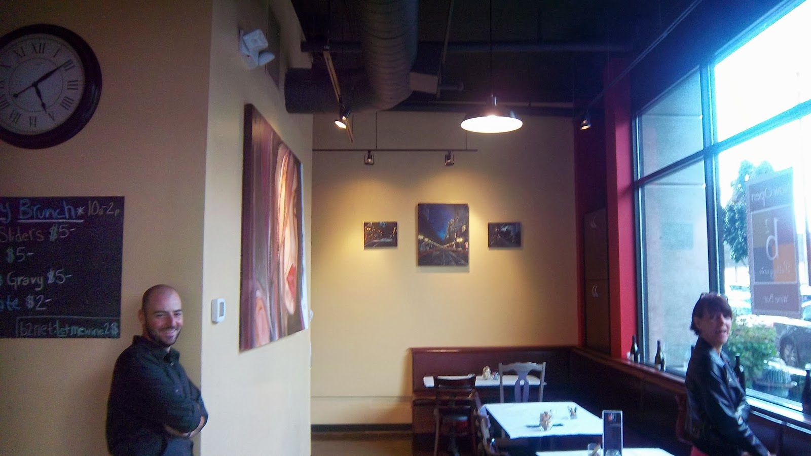 | |
| My wonderful wife Lecia and buddy Zach helped position the paintings |
I hung the final of the three Urban Landscapes I did for the B2 Wine bar in the Pearl.
This little gem in the Pearl District just opened this month. My wonderful wife Lecia and my good friend and golf guru Zach Welch gave me a hand in the positioning. Now I just have to move the lighting a little more to center. I have one more to do for the wine bar, but according to Zach, there has been interest shown in the center painting already, so with a little luck I could be doing even more.
The coffee shop B2 Coffee Haus, which is located a few doors up in the same building features 8 of my watercolor paintings as well. I'm not going to lie about this. When I went in to hang this third painting, I was stilll very pleased with how the other small painting came out. Usually there will be something that I want to change about a painting, but this one still suited my eye.
Of course you can always get better, and I will. However it is necessary to be satisfied with a result. That's what keeps me going. That and being able to see my work somewhere other than in my painting space.
I have been wanting to paint more, but time hasn't allowed it lately. This makes for some frustrating days. Hopefully this will change soon. When faced with such a small amount of time and so many choices of what to do, the brain will often choose to do nothing. That's the battle I'm facing now. I have so many ideas, but I know I don't have time to do even one full painting, so I end up not even getting started on one.
Sunday, September 15, 2013
Cityscape: New Lessons learned

As I read through the original post about this painting I realized how my opinion had changed. So I decided to update what I think about this painting.
It is interesting to see how my opinion can change about my own work even though I have left it alone. This painting grew on me more and more as the weeks went by. I began to look at all the positive things rather than where I had struggled with it. So when I look at it today, I am satisfied and comfortable with it. There will always be things that you feel you could have done better, but at the end of the day, if you achieve the visual result you wanted, you have suceeded.
Saturday, August 31, 2013
Busy Saturday

Sunday, August 25, 2013
Early Saturday.
 |
| Early Saturday on 6th 12X16" Acrylic on Canvas |
I started this one Saturday morning. I chose the smaller canvas thinking that I first needed to establish a rhythm of painting. Initially I couldn't picture in my head how the painting would work, but I kept going. I added layers to the foreground, established some lines and kept adding layers. Eventually I was able to work thru the problems and it emerged quite nicely. I'm learning that you can't paint as freely with Acrylic as you can with watercolor, unless you don't mind wasting a bunch of paint. I usually mix colors on the fly, but I don't expect them to dry out in 10 minutes. I know there are ways to make them last longer, and I'll have to look into doing that. I do like that you can layer them as well as make them opaque. Well, its on to the next canvas. I need to do a larger painting. This one's 12X16"
Downtown Early Morning...So Far

One thing I have discovered again about Acrylic paint. It dries faster on the pallette than you can paint most of the time. This makes me think harder about moving to oils.
Thursday, August 22, 2013
Remembering what works

The most incredible thing about the internet is, you can just surf around and get inspired by all the Artists out there who are doing things you admire. The down side in a way is that you realize how many talented Artists are out there, and you can feel like getting noticed will be difficult at best. Making a living in art has always been difficult, and when I see how many Artists are represented, it seems to me that the market is pretty flooded. The up side is that once you start to feel like you are making the work you can show, you can get it out there instantly. Anyway, I was doing some research for my next painting, which I've decided will be an urban scene. A couple of clicks later, I found some fantastic paintings that I can use as a spring point for inspiration and composition reference. Then I looked up one of my own paintings that I liked to remind myself how I treated the street lights. This Woodstock painting came out succesful because I was able to get the transition of intensity to work. More later on this. By the way, one of my favorite artists (so far) when it comes to urban Landscapes is Jeremy Mann. I will get some links in later, but for now I have to go.
Tuesday, August 20, 2013
Not finished but...Next...New Subject.

Editors Note: I'm inserting this in the first part of my entry because I forsee some helpful hints coming my way. I should first point out that I wasn't finished with this painting. I realize the sky has more detail than the foreground, which gives it a problem with depth and cohesion. I was going to work on the foreground next. I welcome comments, but at this point I'm not going further with this painting because of time constraints...
Original Post;
I spent the better part of a morning trying to fix what I thought was wrong with this painting. For a painting that has a dominating sky, there wasn't enough "drama" if you will. I inserted some dark clouds at the top and thought about adding more. But I got to the point that I really wasn't interested in the topic anymore. To me, the subject itself didn't keep me interested. The top painting is more what I would have wanted. That's a cropped version and the camera picked up some interesting patterns that I don't see in the original. The color variations are a little different. I would consider the top painting (in its presentation here) to be more successful than the second photo of the exact same painting below. Of course, in my hurry to blog, the second photo is blurry (once again) and as a result ends up looking much less professional. I don't dislike this painting, and I don't consider it a total failure. It just doesn't move me when I look at it.
I haven't finished putting in some of the grass in front and bringing in more of the contrast. But for now, I have more pressing needs. I need to present some finished paintings for my new project. I don't think this will end up being one of them.
Having said that, we all know that when someone stops worrying about a painting, they often can come back and somehow make it work .
I thought I should post something on this painting since I started with it, but encouragement is not what I'm looking for today. I need to move forward. Gotta go.
 |
| It does suffer a bit from the two in one problem at the is point. The sky is not matching up with the ground quite yet. The dimensions of the canvas are not really to my liking for this scene. |
Monday, August 12, 2013
New Beginnings and Traditional subjects
I guess I should mention that this painting is on canvas, and I'm working in Acrylic.
 | |
| That tornado on the right is unintentional. I sprayed water on the painting and the drip created that . It clearly doesnt belong here. Maybe in another ....not a bad idea. |
 |
| Looking a little stiff and plain. I need to step it up somehow. |
Sunday, July 14, 2013
B Squared Coffed Haus and Wine Bar
Getting Closer: After a couple of days of scrambling to get 7 paintings framed, I am finally ready to hang them at the B Squared Coffee Haus. I have to remember that unless I paint in specific sizes, I will have to wait 2 to 3 weeks to get my paintings framed. I had to crop some of these paintings in order to get them to fit in the pre-made wood frames. Luckily, the only frame color I needed was black, since my supplier carries that and natural wood. I haven't looked into other frame shops much, but I am pretty loyal to the I've Been Framed Art supply and framing store. They cater to the working and aspiring artist and their prices and helpfulness can't be beat. More later...
 |
| I painted a large version of the Summer Lightning Painting for the B Squared Coffee Haus. I'm in the process of mounting it on Gator Board. Trying to figure out how I can hang this. I wasn't able to find cradle board to fit the 22 X 42 size on short notice. |
 |
| My mat cutter served me well for all of these paintngs. I was able to cut them to very specific sizes to fit the pre-made frames. |
Thursday, June 6, 2013
Friday: More on the Passion for painting...
Here is the mostly (deja vue) finalized self portrait. Once again I'm limited in time so I have to scribble down this entry and run.
Lately I'm wondering how committed I actually am to my art. I'll let a painting sit for weeks without doing much of anything to it, even though I feel drawn to act. I think at this point a full time artist would classify me as a hobbyist. It is probably not fair to those who work every day of their lives to create works of art if I call myself an Artist. But I will admit that I do consider myself an artist...only I am not full time. This is somewhat like golf, which by the way has been competing for my time. I am a golfer, but I don't spend every day golfing.
Some people spend their entire lives devoted to creating fine works of art without regard to fame or money. They have a passion for it. They are driven towards the goal of creating something great.
I don't see myself as ever making the jump to the "devotion at all costs status". Firstly, I need a certain amount of money to be comfortable. Not a lot, but enough to pay bills, feed myself and do what I want without a ton of worry. I decided this years ago. I did not like the idea of being a starving artist. The bitter, melancholy type who spurns the "dominant paradigm". Secondly, I like doing other things with my time. I like having variety in my life. That includes ridiculous things like chasing a little white ball around a well- groomed pasture and knocking it into a little hole.
Ultimately, my goal is to become a full-time artist when I retire. I know creating art is in my blood. And that need to create will never go away. I have been given that gift and I can't squander it.
So even though I haven't been acting on my instincts to paint lately, they are there. They are there every morning when I wake up and every night when I go to bed.
So I am asking myself today. Does this instinct qualify as passion if I don't find time to act on it? And at this point, looking at the question typed out in front of me, the answer I hear is...no. And the word 'squander' pops into my head. More later.
So here it is Friday, a day after that above post. I want to be clear that I wasn't looking for encouragement or advice when I posted that information, although I do appreciate those things.
Years ago I had a problem getting to work on time. I would get there and tell my friend and co-worker why I was late and apologize. Finally one day he said something that has stuck with me to this day. "Kevin, I don't want to hear any of your bull-s--t excuses". We are friends to this day. It took me awhile to come around, but I eventually figured out how to get to work on time.
Years before, someone used the old expression "excuses are like (you know whats), everyone has one". That has also stuck with me. No one really wants to hear your excuses. Either do it or don't.
I know that I procrastinate. I get easily side-tracked. So when I looked at the painting yesterday, I had to be honest with myself. Why has it taken so long to finish this? Yes, it was important to take my time, but I could have had this done weeks ago had I set aside a small amount of time. So I have to evaluate how much time I have to dedicate to what I love doing. Because no one knows how much time is left. And I have many more paintings left to do.
Some of the concerns I have when I do have the opportunity to paint full-time. Will it dog me? Will I feel pressed to get something done? How can I schedule my creativity? I don't want this to feel like a job.
That's enough for today. I have to start the next painting.
Lately I'm wondering how committed I actually am to my art. I'll let a painting sit for weeks without doing much of anything to it, even though I feel drawn to act. I think at this point a full time artist would classify me as a hobbyist. It is probably not fair to those who work every day of their lives to create works of art if I call myself an Artist. But I will admit that I do consider myself an artist...only I am not full time. This is somewhat like golf, which by the way has been competing for my time. I am a golfer, but I don't spend every day golfing.
Some people spend their entire lives devoted to creating fine works of art without regard to fame or money. They have a passion for it. They are driven towards the goal of creating something great.
I don't see myself as ever making the jump to the "devotion at all costs status". Firstly, I need a certain amount of money to be comfortable. Not a lot, but enough to pay bills, feed myself and do what I want without a ton of worry. I decided this years ago. I did not like the idea of being a starving artist. The bitter, melancholy type who spurns the "dominant paradigm". Secondly, I like doing other things with my time. I like having variety in my life. That includes ridiculous things like chasing a little white ball around a well- groomed pasture and knocking it into a little hole.
Ultimately, my goal is to become a full-time artist when I retire. I know creating art is in my blood. And that need to create will never go away. I have been given that gift and I can't squander it.
So even though I haven't been acting on my instincts to paint lately, they are there. They are there every morning when I wake up and every night when I go to bed.
So I am asking myself today. Does this instinct qualify as passion if I don't find time to act on it? And at this point, looking at the question typed out in front of me, the answer I hear is...no. And the word 'squander' pops into my head. More later.
 |
| What, this again? About time... |
Years ago I had a problem getting to work on time. I would get there and tell my friend and co-worker why I was late and apologize. Finally one day he said something that has stuck with me to this day. "Kevin, I don't want to hear any of your bull-s--t excuses". We are friends to this day. It took me awhile to come around, but I eventually figured out how to get to work on time.
Years before, someone used the old expression "excuses are like (you know whats), everyone has one". That has also stuck with me. No one really wants to hear your excuses. Either do it or don't.
I know that I procrastinate. I get easily side-tracked. So when I looked at the painting yesterday, I had to be honest with myself. Why has it taken so long to finish this? Yes, it was important to take my time, but I could have had this done weeks ago had I set aside a small amount of time. So I have to evaluate how much time I have to dedicate to what I love doing. Because no one knows how much time is left. And I have many more paintings left to do.
Some of the concerns I have when I do have the opportunity to paint full-time. Will it dog me? Will I feel pressed to get something done? How can I schedule my creativity? I don't want this to feel like a job.
That's enough for today. I have to start the next painting.
Monday, May 27, 2013
Fixing up and moving on

By the way, I need to add that I recognized that I was not as focused as I needed to be when I went in to do the neck. I moved ahead anyway knowing that as long as I didn't do anything drastic, I could fix it. Hopefully I was right.
Monday, May 20, 2013
Stage Three: Digital Delay. Reference photo has no neck.

Now that I've vented, the actual photo is on this computer and I'll have to upload to the digital frame to go any further. The danger of not being able to work on something when I'm ready is that I start to tinker with the finished parts. So instead of tinkering, I decided to post this. More as it develops.
Wednesday, May 8, 2013
Second Stage
Slowly, (and I mean slowly) but surely the painting is coming along. At this second sitting...by the way, who EVER has used that term in reference to watercolor.?.. It feels like I'm working on an oil painting. This time however, it's because I'm putting multiple layers in the dark areas to build the shadows rather than putting color in and dabbing out the light areas. When I started this, I used only the colors that were on my palette, which made for some interesting color combinations. But as I progressed into this stage, I ran out of paint and had to decide what I really wanted to use for color. I chose raw sienna, Ultramarine Blue and of course my old standby for cool shadows, Cerulean Blue. I also dabbed some Davy's Gray on my pallet to add to the Ultramarine blue if I need it. I should mention that just before I ran out of paint on my palette, I found a little well of Yellow Ochre. I found this to work nicely to represent the lighter area of the shadow on the forehead. I'm feeling like I could make a fatal error by not having an actual planned color scheme, but so far it's working just flying by the seat of my pants. At one point I was thinking I should make some decisions on what I want to do, but I think it's more exciting to just go by feel and see what happens. And now that I've kind of seen whats working I will probably stick with that Ultramarine Blue, Davys Gray, Yellow Ochre and some of the reds that seem to have worked in representing the skin as it emerges from the shadow. This is intended to be a dark painting, which in some ways helps. As long as I get the values close it should work. In the back of my mind I'm also thinking that if I lose this painting, I have another one in me. So in some ways, this is a "study" that might end up being an actual finished painting. My favorite way of painting is with cautioned expectations. I end up painting more relaxed. Notice the splashes and drips where I've thrown the color on. That's the best part of watercolor to me.

As an added note. I always like seeing how the photos come out. Seeing this in 2D helps me see some of the fixes that are needed in the composition. And the compacted view helps me see if my value range is working.

As an added note. I always like seeing how the photos come out. Seeing this in 2D helps me see some of the fixes that are needed in the composition. And the compacted view helps me see if my value range is working.
Wednesday, May 1, 2013
Latest News: Self Portrait

Lately my work schedule is not conducive to painting (or sleeping for that matter), but I've found time to golf so there really is no excuse not to paint as well.
Monday, April 15, 2013
Library sketch

Saturday, March 30, 2013

In a fist fight with detail. Patience on Trial...and, "Cosmic Rocks?"
I posted the current stage of this painting first. That's because I knew this would appear as my thumbnail pic, and I didn't want to deceive the viewer into thinking the mid stage pic was where I'm at. I'm completely aware that the mid stage picture might look better, but in reality it is not.
I went into this one with the intention of grinding out the details in small bits and pieces to make one cohesive, identifiable painting...The more I tried, the less it worked. I'm disappointed at the result. Not so much because of the painting at this stage, but because of the amount of time I invested in trying to make this work in the way I had intended. I could not find the right color of blue show what I wanted to portray. The cool reflection of light on the surface. This was frustrating, and I had to leave it the way it was for now.
I woke up this morning thinking about where I can make a studio space for oil painting. This would have been so much easier in oil. And I don't even work in oil. The writing is on the wall for me, and I have to make the commitment to making this happen.
With watercolor I have found that as much as I try to work from light to dark, I can't resist throwing in some darks before I have finished under-laying the lights. I have to have a visual reminder of where I'm headed. I think this is where I get myself into trouble. Because I have to keep pulling those darks back out where they have bled too far into the light areas. I also have a hard time accepting too many hard lines in my paintings because I feel they look forced.
You might think by looking at the first painting that it was going well. But as I mentioned, the painting wasn't looking cohesive with the lighter, sharper lines on the left side (which are out of the frame in that photo). I do see that the light reflections are more successful in the earlier stage, and I'll probably go back in and make them more prominent in the finished version. For now I'm moving on to my next project, taking the lessons learned here into account.
Andrew Wyeth once said. " If one could only catch that true color of nature - the very thought of it drives me mad." And I thought it was just me.
One final note. If you can't tell what my subject is, don't worry. Part of my disappointment comes from knowing that the subject is not evident. Nothing is more discouraging in my mind as when someone has to ask what it is you're painting. Suffice it to say that I have now decided to classify this as an abstract and title it Cosmic Rocks.
In a somewhat unrelated note. One of my favorite painters is showing in NY. Heres the link to the show.

 | |
| Current Stage:The camera loves to pick out that light blue (Cerulean), but this was as close as i could get to showing the actual colors. That Light blue is not as evident in the actual painting. Maddening. |
 | |
| Mid Stage: This seemed to be going in the right direction here, but I wasn't happy with the forms, mostly because the left side, which I didn't get in frame, wasn't blending with the rest of it. I thought about leaving the bottom blank. When I went back to it, I decided that was actually drawing too much of the eye. Keep in mind that the bottom was completely white, not that cool looking color the camera gave the blank area. |
I woke up this morning thinking about where I can make a studio space for oil painting. This would have been so much easier in oil. And I don't even work in oil. The writing is on the wall for me, and I have to make the commitment to making this happen.
With watercolor I have found that as much as I try to work from light to dark, I can't resist throwing in some darks before I have finished under-laying the lights. I have to have a visual reminder of where I'm headed. I think this is where I get myself into trouble. Because I have to keep pulling those darks back out where they have bled too far into the light areas. I also have a hard time accepting too many hard lines in my paintings because I feel they look forced.
You might think by looking at the first painting that it was going well. But as I mentioned, the painting wasn't looking cohesive with the lighter, sharper lines on the left side (which are out of the frame in that photo). I do see that the light reflections are more successful in the earlier stage, and I'll probably go back in and make them more prominent in the finished version. For now I'm moving on to my next project, taking the lessons learned here into account.
Andrew Wyeth once said. " If one could only catch that true color of nature - the very thought of it drives me mad." And I thought it was just me.
One final note. If you can't tell what my subject is, don't worry. Part of my disappointment comes from knowing that the subject is not evident. Nothing is more discouraging in my mind as when someone has to ask what it is you're painting. Suffice it to say that I have now decided to classify this as an abstract and title it Cosmic Rocks.
In a somewhat unrelated note. One of my favorite painters is showing in NY. Heres the link to the show.
Thursday, March 14, 2013
Library "Study"?
 |
| Woodstock Library from the Lawn |
The Library was rebuilt in....2000 I believe, and even though the new building itself has a short history, the Library history is there.
This was intended to be a loose rendering of the building but as I progressed through, I had to tighten the lines a little. I wanted to include a library goer in the final painting, and this would be from an angle looking opposite this, but I was pleasantly surprised how this one came out. I spent considerably more time on this than I originally planned, trying to work out the reflections in the windows, the grass in front and the trees that are beginning to bud. I still plan on painting the nice lady that I photographed in my reference photo. She asked to remain anonymous, so I won't mention her name when I paint her. Anyway, I think this painting came out better than I thought it would, so I might just choose this one to submit if the next one doesn't work. Sometimes the study offers more interest to the viewer. I will have to see.
I guess I would be remiss if I didn't mention the other neighborhood Icon in this painting. The Joinery
Sunday, March 10, 2013
Garlic and Banana

Saturday, March 2, 2013
Portlandia season Finale: Banana and Garlic too...


Sunday, February 24, 2013
Messing around with paint Arena Shawn style: Abstract

Wednesday, February 20, 2013
Foster Apartment sketch

Tuesday, February 19, 2013
Floating objects


Sunday, February 17, 2013
Matting and framing


I made a note to myself. The top painting was intended to be a quick sketch, but it came out pretty good. I shouldn't have used the cheap drawing paper. There were some obvious defects in the paper that showed up.
Saturday, February 9, 2013
Birch Tree final answer....

At some point early in the week, I decided that the effort I put into the (first) Birch Tree painting was insufficient. Though I rarely do this I started it over. The reason I rarely do a painting again is I feel that if I don't succeed, I will have wasted twice as much time on one thing. Time doesn't allow me to waste time on one try, much less two tries. But I felt strongly about this project. There were elements in the first one that showed possibilities. I took the reference photo at Gabriel Park last winter and had thought about it quite a few times.
To be honest, it's hard to go wrong with birch trees in the sense that the white bark makes it immediately recognizable. The angle looking up is appealing to the eye, and....it's a tree. No one can accuse you of putting a branch in the wrong place. Speaking of which, I found it a challenge to get the branch coming in from the right side of the painting to look right. It followed the angle of the branch behind it, which made it look too symmetrical to the branch behind it.....If you want to read the boring details there's more below.
Tuesday, February 5, 2013
Small Framed Paintings, Birch Tree started


Tuesday, January 22, 2013
New Mat Cutter

Sunday, January 20, 2013
Warehouse finished
 | |
| I tried to strengthen the color a little to convey the strong sunlight against this yellow building. |
Saturday, January 12, 2013
Warehouse
 |
| Warehouse. Still in progress I guess. |
Subscribe to:
Posts (Atom)